1. Too Much Text
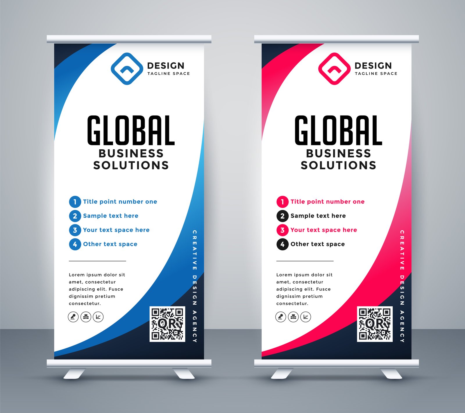
A roll-up stand is read from a few metres away, often while someone is walking past a busy exhibition aisle — not sitting down with time to read a paragraph. Cut copy down to a headline, 2–3 short supporting points, and a call to action. If it needs a full paragraph to explain, it belongs on a handout, not the stand.
2. Text Set Too Small
A common mistake carried over from print or web design: body text under roughly 24–30pt becomes genuinely hard to read at standard viewing distance for a roll-up stand. As a rule of thumb, headline text should be readable from 5–6 metres away, and no text should be smaller than what's comfortably legible from 2 metres.
3. Low-Resolution Images Stretched to Fit
Roll-up stands are large — typically 85cm x 200cm — so a logo or photo pulled from a website (usually 72 DPI) will look visibly pixelated once scaled up. Source images at full resolution for the final print size, or ask your designer for vector versions of logos wherever possible.
4. Ignoring the Safe Zone Near the Base
The bottom 10–15cm of a roll-up stand sits inside the cassette base and can be partially obscured depending on the stand model and the angle it's viewed from. Keep critical text and logos out of this zone, and out of the very top edge too, to avoid anything looking awkwardly cropped.
5. Poor Contrast Between Text and Background
Light grey text on a white background, or dark text on a busy photographic background, might look fine on a calibrated design monitor but becomes nearly unreadable under bright exhibition hall lighting. Stick to high-contrast combinations — dark text on a light, largely flat background, or vice versa.
6. No Clear Single Call to Action
Similar to flyers, a roll-up stand should drive one action: scan a QR code, visit a booth number, ask about a specific offer. Multiple competing CTAs dilute the message and often mean visitors remember none of them.