1. Lead With One Clear Message
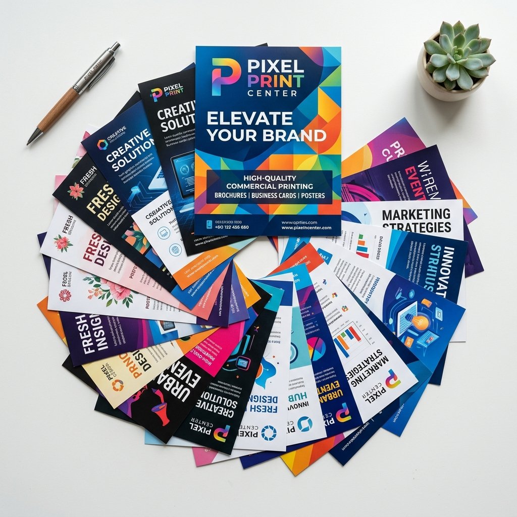
The biggest mistake we see in flyer artwork is trying to say everything at once — the offer, the opening hours, three phone numbers, and a full product list, all on one A5 sheet. A flyer has about two seconds to earn a second look. Pick the single most important thing you want the reader to remember (a discount, an event date, a new product) and make it the largest, boldest element on the page. Everything else supports that one message rather than competing with it.
2. Use a Strong Visual Hierarchy
Once you know your main message, arrange the page so the eye naturally moves from headline, to supporting image, to call to action. Designers call this hierarchy, and it is created with size, weight, and colour contrast rather than borders and boxes. A 70pt headline in bold, a supporting line at 18–24pt, and a clear CTA button-style element at the bottom will always outperform a page where every line of text is the same size.
3. Leave Room to Breathe
White space is not wasted space — it is what makes the content you do include easier to read and more premium-looking. Dubai businesses often try to fill every millimetre of a flyer to "get their money's worth" from the print run, but a cluttered flyer reads as low-cost and is genuinely harder to scan. Aim for margins of at least 5mm beyond your bleed, and don't be afraid of empty space around your headline.
4. Choose Print-Ready Colours and Fonts
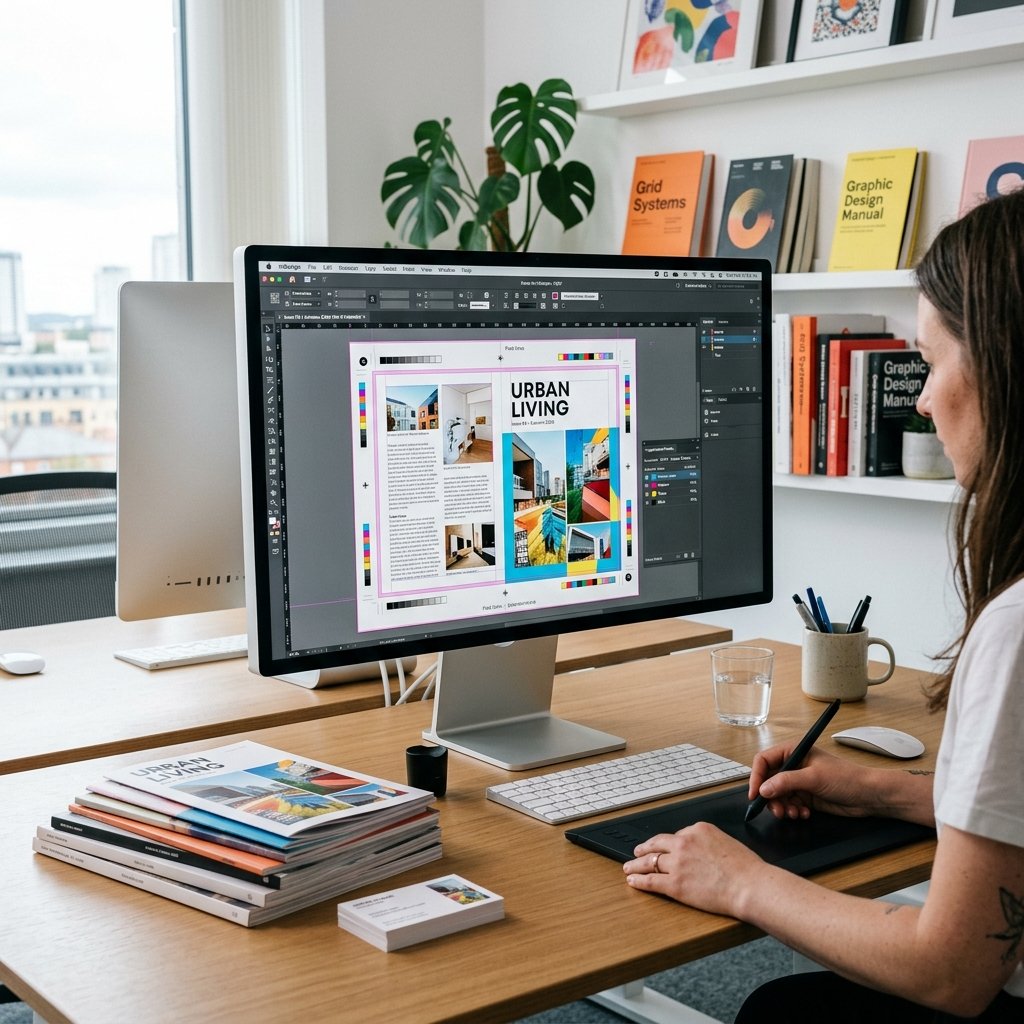
Screens display colour in RGB; printers use CMYK. A vivid blue that looks perfect on your laptop can print noticeably duller or shift toward purple if the file isn't converted to CMYK before it goes to press. Always design (or ask your printer to convert) in CMYK from the start, and stick to two or three font families maximum — one for headlines, one for body text, and optionally one accent font for callouts.
5. Include One Unmistakable Call to Action
Every flyer should end with an obvious next step: "Call now", "Visit us on Sheikh Zayed Road", "Scan for 20% off", or "WhatsApp us for same-day delivery". Make the CTA visually distinct — a coloured button shape, a QR code with a short instruction next to it, or a highlighted phone number — so it's the very last thing the reader's eye lands on before they decide whether to act.
Getting It Print-Ready in Dubai
Once your design follows these five principles, the technical checklist matters just as much: 300 DPI resolution, CMYK colour mode, and a 3mm bleed on every edge so nothing gets clipped during trimming. Our team checks every flyer file free of charge before it goes to print — if something isn't print-ready, we'll flag it and suggest a fix rather than printing it as-is.